MICA GD 200.01
Thursday 9am-3pm, Brown 305
Instructor: Ryan Clifford, ryan.d.clifford@gmail.com, 410.340.8636, Office: Brown 316
GTI: Aura Seltzer, aura.seltzer@gmail.com
Thursday 9am-3pm, Brown 305
Instructor: Ryan Clifford, ryan.d.clifford@gmail.com, 410.340.8636, Office: Brown 316
GTI: Aura Seltzer, aura.seltzer@gmail.com
Saturday, October 9
Celebrate the "Powers of 10" on 10/10/10
http://www.fastcodesign.com/1662461/how-to-apply-eamess-legendary-powers-of-10-to-real-life-problems
Wednesday, October 6
Moxy Creative's 10 Movie Posters
Moxy Creative just launched designs for 10 movie posters inspired by Men's Style. Here are 4 of the 10. You can see the others (and purchase prints) here.


ok so the blue ones are playing off the imagery of all the packaging that runs through the movie which i think a cult following would get. the top one is a different concept with the air freshener that is seen in most of the cars. im somehow not doing the half tones right because i cant figure out how to change the color of them, so once i figure that out thins may change a bit
Tuesday, October 5
Arcade Fire Covers


Great series of album covers, good use of single color, typography, and halftones for the inside covers. See them all HERE.
Night of the living Dead Designs


Night of the Living Dead. Feel like somethings feel odd but I don't know for sure. wanted to add more to the last one but I still don't know yet.n Also the second one has a ground of stained coffee paper with the edges burt. Is this allowed? I only used two other colors counting the stained ground as a color.
-Candace
Fantastic Fest Film Posters


Here are the posters I shared from Fantastic Fest. The Corman Poster, Rubber, and X, the man with the X-Ray Eyes are particularly successful and relevant to our project.
Posters are HERE.
Sunday, October 3
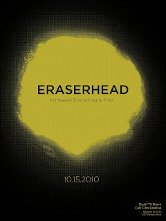
Eraserhead poster
Gabe Kelley - Escape from New York poster

Color variation
 The color in the background will be the paper that I print on. I used the recurring line from the film for the slogan, because the other I felt was just too long, and as it is a cult film festival, the audience will know directly what I am referencing with the quote.
Any ideas to push it further? Or anything to change completely?
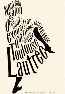
Posters (IMAGE-BASED and TEXT-BASED)
Subscribe to:
Posts (Atom)


