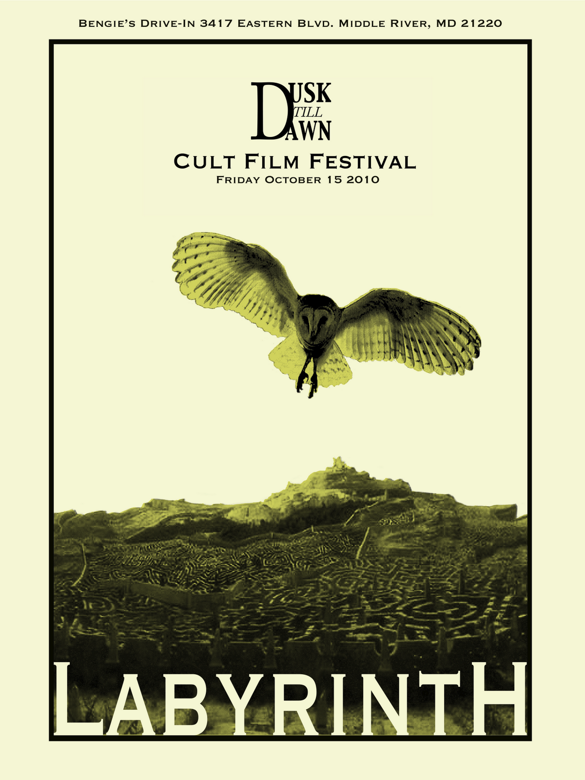
There are a few things I would try to resolve before your final print. With this color combination (which I like with the paper color you're using), I wonder how it would look if the city was left in just black and the paper color and the owl was the only use of color. If you have time, I would open your images in Photoshop and change the levels slightly; the middle tones are really dark, and I'm worried will print even darker when you're using a colored paper.
Typographically, I find the capital L and H in Labyrinth a bit distracting, and the D in Dusk till dawn is too dominant. A solution could be to treat the Dusk Till Dawn Cult Film Festival more simply and the same for the entire phrase. Maybe placing both that line and the Bengies Drive In within the strong border you've drawn? In your case, the reader should probably see the owl first, then Labyrinth, then all the secondary text. Almost there!
There are a few things I would try to resolve before your final print. With this color combination (which I like with the paper color you're using), I wonder how it would look if the city was left in just black and the paper color and the owl was the only use of color. If you have time, I would open your images in Photoshop and change the levels slightly; the middle tones are really dark, and I'm worried will print even darker when you're using a colored paper.
ReplyDeleteTypographically, I find the capital L and H in Labyrinth a bit distracting, and the D in Dusk till dawn is too dominant. A solution could be to treat the Dusk Till Dawn Cult Film Festival more simply and the same for the entire phrase. Maybe placing both that line and the Bengies Drive In within the strong border you've drawn? In your case, the reader should probably see the owl first, then Labyrinth, then all the secondary text. Almost there!